Header Wallpaper

High quality TOZ logo

Satanic Eagle1 min to read

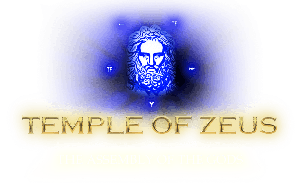
Here's an attempt of recreating the TOZ logo at a higher resolution. The original image also had remnants of circles surrounding the pentagram, they have been removed. I've provided my remake, and a downscale of it which uses the same resolution as the original logo.

Any feedback would be appreciated.

Here's the large image, 2200 x 1028

Here's a down-scaled version, which matches the size of the original TOZ logo (550 x 250)

And here's the original one for reference

#20

The Logo looks awesum !!!!

#21

Maby move it a bit to the left just a suggestion. Haha

#22
Satanic Eaglesaid:

...

Happy Beltane’s Eve brother!

Is there a why you could also upgrade the Icons on the startpage of the ToZ?

You know, those little white pentagrams, which lead you to the different sections like „Welcome“, „Satan“, „Zevism“ etc.

I just noticed how cool and convenient it is to have an artist here, who is willing to put some effort in for Satan. =)

[ email redacted ]

"Don’t quit. Suffer now,
and live the rest of your life as a Champion.“

Read the Temple of Zeus: Learn the truth and knowledge that has been secret and forbidden for MILLENIA!!

STAND TALL, BE PROUD, BE STRONG, YOU ARE PART OF ZEUS‘S HOUSE!

HAIL LADY INANNA!!
HAIL LORD APOLLO!!
HAIL BAAL-ZEBULON!!
HAIL FATHER ZEUS!!

#23
Satanic Eaglesaid:

...

I totally LOVE the new style, thank you for that!
And also Thank you Commander for updating them!

[ email redacted ]

"Don’t quit. Suffer now,
and live the rest of your life as a Champion.“

Read the Temple of Zeus: Learn the truth and knowledge that has been secret and forbidden for MILLENIA!!

STAND TALL, BE PROUD, BE STRONG, YOU ARE PART OF ZEUS‘S HOUSE!

HAIL LADY INANNA!!
HAIL LORD APOLLO!!
HAIL BAAL-ZEBULON!!
HAIL FATHER ZEUS!!

#24
Satanic Eaglesaid:
Soaring Eagle 666said:

...

Obviously readability and clarity is very important with this, checking the 550 x 257 version (the one the ToZ website uses) on my phone, it is still readable, though I can understand your concerns.

Personally, I believe it is a small sacrifice in clarity for a nice effect that really brings the text forward from the pentagram, I wanted to give the logo a cleaner look, while giving it presence. However, the decision isn't mine to make, and it is going through alterations at the moment.

This is also beautiful. However, I think the little dark tint on the letters, is dark and cool in a beautiful way.

#25
This is the targeted message.
NinRicksaid:
Satanic Eaglesaid:

...

I totally LOVE the new style, thank you for that!
And also Thank you Commander for updating them!

Waiting a bit to update on the other websites also, will happen soon. We're having some technical difficulty right now.

Plan is to update all the logos.

#26
HP. Zevios Metathronossaid:
NinRicksaid:
Satanic Eaglesaid:

...

I totally LOVE the new style, thank you for that!
And also Thank you Commander for updating them!

Waiting a bit to update on the other websites also, will happen soon. We're having some technical difficulty right now.

Plan is to update all the logos.

Sounds great! It does has a great impact on how you feel when you access the sites and look on the Logo.
Didn't think it would be that much tbh. So I am looking forward to that!

[ email redacted ]

"Don’t quit. Suffer now,
and live the rest of your life as a Champion.“

Read the Temple of Zeus: Learn the truth and knowledge that has been secret and forbidden for MILLENIA!!

STAND TALL, BE PROUD, BE STRONG, YOU ARE PART OF ZEUS‘S HOUSE!

HAIL LADY INANNA!!
HAIL LORD APOLLO!!
HAIL BAAL-ZEBULON!!
HAIL FATHER ZEUS!!

#27
Satanic Eaglesaid:

...

The new logo makes the sites look much nicer! However, in the old logo, I love the way the goat's eyes stare back at you! The new one just doesn't seem to capture that alive expression. I wouldn't want to ask you to spend time trying such a complicated change, so I did. Here's my attempt at creating a high-quality version of the old logo in a similar style. It's a bit brighter, and I kept the ellipse underneath, but the goat has the original face. Here's a side-by-side comparison:


I think mine is an improvement, but both are beautiful. It's fine if we stick with your version, but I wanted to post my attempt to see what everyone thinks. I can easily tweak the effects to make it darker if you want to see how that would look.

NinRicksaid:

Is there a way you could also upgrade the Icons on the startpage of the ToZ?

You know, those little white pentagrams, which lead you to the different sections like „Welcome“, „Satan“, „Zevism“ etc.

The white pentagrams do need to be updated. The new logo makes it especially obvious. I've been planning to update the whole home page, and this seems like a good time to start, so here's my version:

It is also live on the Tor site.
I chose a more modern font and the new white pentagram has nothing in the center because I think the empty hole makes nice bullet points for the list. To keep the page clean, I'm going to move the "Important Information" link to the Welcome page.

Feel free to make suggestions!

#28
Soaring Eagle 666said:

...

I think it looks great!

#29
Soaring Eagle 666said:
Satanic Eaglesaid:

...

The new logo makes the sites look much nicer! However, in the old logo, I love the way the goat's eyes stare back at you! The new one just doesn't seem to capture that alive expression. I wouldn't want to ask you to spend time trying such a complicated change, so I did. Here's my attempt at creating a high-quality version of the old logo in a similar style. It's a bit brighter, and I kept the ellipse underneath, but the goat has the original face. Here's a side-by-side comparison:


Damn brother I think it looks very good. I like how brightly everything shines, it is so vibrant.

I do believe the new Pentagram looks way better, but my mind has a hard time accepting it, as I got so used to the old pentagram. :lol:

But it does look better.

Thank you! =)

[ email redacted ]

"Don’t quit. Suffer now,
and live the rest of your life as a Champion.“

Read the Temple of Zeus: Learn the truth and knowledge that has been secret and forbidden for MILLENIA!!

STAND TALL, BE PROUD, BE STRONG, YOU ARE PART OF ZEUS‘S HOUSE!

HAIL LADY INANNA!!
HAIL LORD APOLLO!!
HAIL BAAL-ZEBULON!!
HAIL FATHER ZEUS!!

#30
Soaring Eagle 666said:
Satanic Eaglesaid:

...

The new logo makes the sites look much nicer! However, in the old logo, I love the way the goat's eyes stare back at you! The new one just doesn't seem to capture that alive expression. I wouldn't want to ask you to spend time trying such a complicated change, so I did. Here's my attempt at creating a high-quality version of the old logo in a similar style. It's a bit brighter, and I kept the ellipse underneath, but the goat has the original face. Here's a side-by-side comparison:


Those are really good Soaring Eagle. Well done!

#31
Soaring Eagle 666said:

The white pentagrams do need to be updated. The new logo makes it especially obvious. I've been planning to update the whole home page, and this seems like a good time to start, so here's my version:

I love this! The pentagrams and text next to them look stunning :)

#32

Nice :o

#33
Shadowcatsaid:

nice job I like it alot. I want to get into digital art myself. Should probly start with a Wacom tablet. Most of my media is colored pencil,pen, marker, paint, pastels or other. :lol:

You might consider Huion, it's cheaper and does the same. That's the one I know and use at least, there might be cheaper options as well.

Also there is an argument against visual display tablets because of posture, so you might go even cheaper by going with an intuous tablet (whatever brand you prefer):
https://www.youtube.com/watch?v=N6A1rSU6Lm8

This is counter perspective to the above, on a classical standpoint that the optimal is the canvas in front of your face:
https://www.youtube.com/watch?v=Znr1OY-aHhM

#34
Satanic Eaglesaid:
NinRicksaid:

...

Here you go, 844 x 1084

Whoa! How fantastic I love this

#35

Looks good. Fits the forum well. I do however think that the old more "gritty" version had it's charm on the official website. But maybe that's just me. The official website (templeofzeus.org) is overall very good in it's original form. Very clean and informative in a yet original way.

I also remember an old version of that had very professional design for a short while before it came down for good. I have always wondered what happened to that one.

“Travel light, live light, spread the light, be the light.” - Yogi Bhajan

#36

Here's a couple more upgraded images:

On the meditations page:

As always, any feedback would be appreciated, and I'm happy to try changes.
Thanks again to Satanic Eagle for inspiration on a good style to use!

xlntsaid:

Looks good. Fits the forum well. I do however think that the old more "gritty" version had it's charm on the official website. But maybe that's just me. The official website (templeofzeus.org) is overall very good in it's original form. Very clean and informative in a yet original way.

I also remember an old version of that had very professional design for a short while before it came down for good. I have always wondered what happened to that one.

I know what you mean. The trouble is that the old graphics look fuzzy, not just "gritty" on high-quality screens, which are becoming increasingly common. But don't worry, the official website is forever preserved in it's "original" form in my offline mirror.

Is this the version of you remember?

#37
Soaring Eagle 666said:

Here's a couple more upgraded images:

On the meditations page:

#38
Soaring Eagle 666said:

Here's a couple more upgraded images:

On the meditations page:

“Travel light, live light, spread the light, be the light.” - Yogi Bhajan

#39

There is already an ongoing effort to design these by a Zevist, please do not see this as voting competition, but rather as distribution of work.