
Quercus
New member
- Joined
- Apr 15, 2024
- Messages
- 77
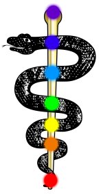
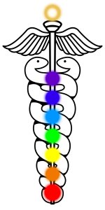
Redrawing this was fun 
I had to make some adjustments as it was hard to tell what was going on in the original image due to compression artefacts. Also I like the glowing Serpents, but I can leave that out if it is too much.
What do you think?
View attachment 2292
I had to make some adjustments as it was hard to tell what was going on in the original image due to compression artefacts. Also I like the glowing Serpents, but I can leave that out if it is too much.
What do you think?
View attachment 2292