
Bravera
Member
- Joined
- Oct 2, 2017
- Messages
- 670
Satanic Eagle said:

Whoa! How fantastic I love this
Satanic Eagle said:
I know what you mean. The trouble is that the old graphics look fuzzy, not just "gritty" on high-quality screens, which are becoming increasingly common. But don't worry, the official website is forever preserved in it's "original" form in my offline mirror.xlnt said:Looks good. Fits the forum well. I do however think that the old more "gritty" version had it's charm on the official website. But maybe that's just me. The official website (joyofsatan.org) is overall very good in it's original form. Very clean and informative in a yet original way.
I also remember an old version of 666blacksun.org that had very professional design for a short while before it came down for good. I have always wondered what happened to that one.
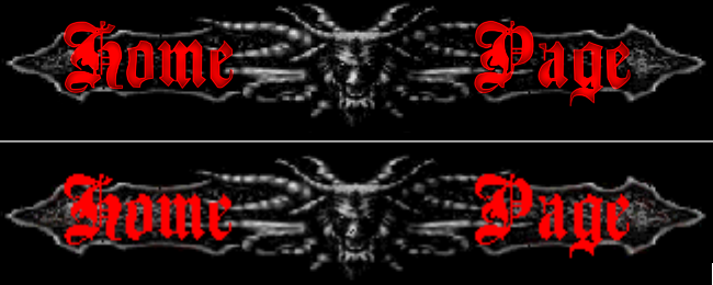
Soaring Eagle 666 said:Here's a couple more upgraded images:
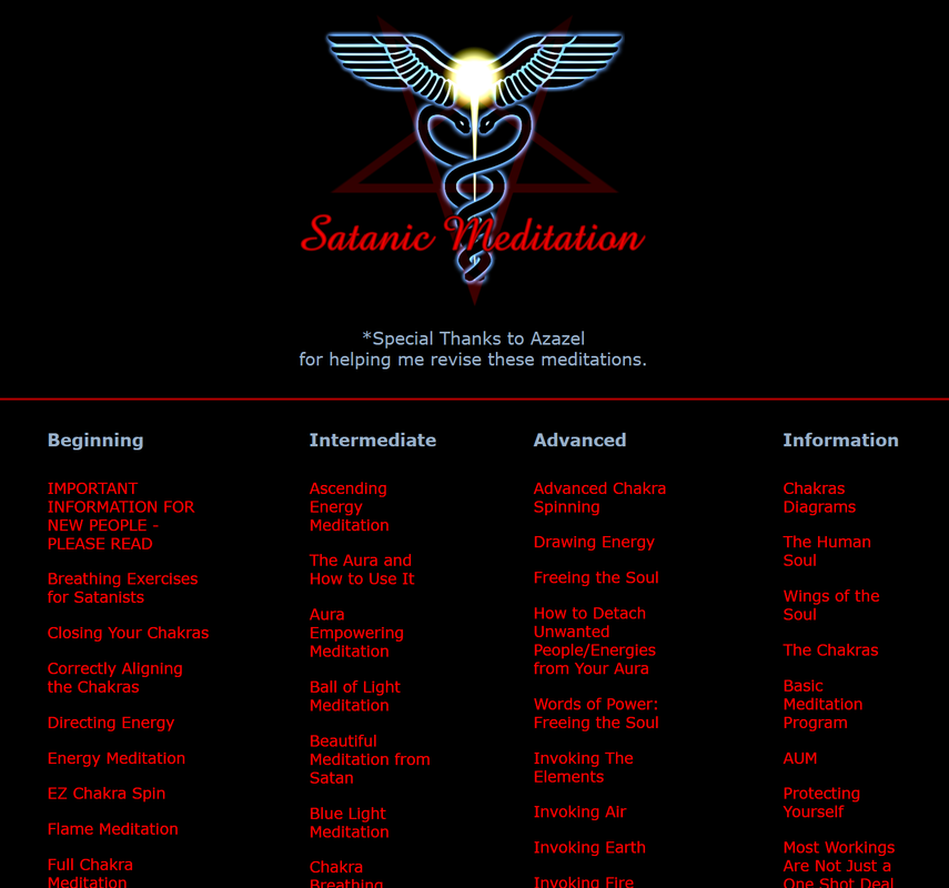
On the meditations page:
The page is live on the Tor site.
As always, any feedback would be appreciated, and I'm happy to try changes.
Thanks again to Satanic Eagle for inspiration on a good style to use!
I know what you mean. The trouble is that the old graphics look fuzzy, not just "gritty" on high-quality screens, which are becoming increasingly common. But don't worry, the official website is forever preserved in it's "original" form in my offline mirror.xlnt said:Looks good. Fits the forum well. I do however think that the old more "gritty" version had it's charm on the official website. But maybe that's just me. The official website (joyofsatan.org) is overall very good in it's original form. Very clean and informative in a yet original way.
I also remember an old version of 666blacksun.org that had very professional design for a short while before it came down for good. I have always wondered what happened to that one.
Is this the version of 666blacksun.org you remember?
https://web.archive.org/web/20121013043048/http://www.666blacksun.org/
Soaring Eagle 666 said:Here's a couple more upgraded images:
On the meditations page:
The page is live on the Tor site.
As always, any feedback would be appreciated, and I'm happy to try changes.
Thanks again to Satanic Eagle for inspiration on a good style to use!
I know what you mean. The trouble is that the old graphics look fuzzy, not just "gritty" on high-quality screens, which are becoming increasingly common. But don't worry, the official website is forever preserved in it's "original" form in my offline mirror.xlnt said:Looks good. Fits the forum well. I do however think that the old more "gritty" version had it's charm on the official website. But maybe that's just me. The official website (joyofsatan.org) is overall very good in it's original form. Very clean and informative in a yet original way.
I also remember an old version of 666blacksun.org that had very professional design for a short while before it came down for good. I have always wondered what happened to that one.
Is this the version of 666blacksun.org you remember?
https://web.archive.org/web/20121013043048/http://www.666blacksun.org/
Lydia said:I love this! The pentagrams and text next to them look stunning")
Lydia said:Lydia said:I love this! The pentagrams and text next to them look stunning
I'd like to retract this statement. The JoS should stay as it is. It's our home, and HPS Maxine designed it. Keep it as it is please.
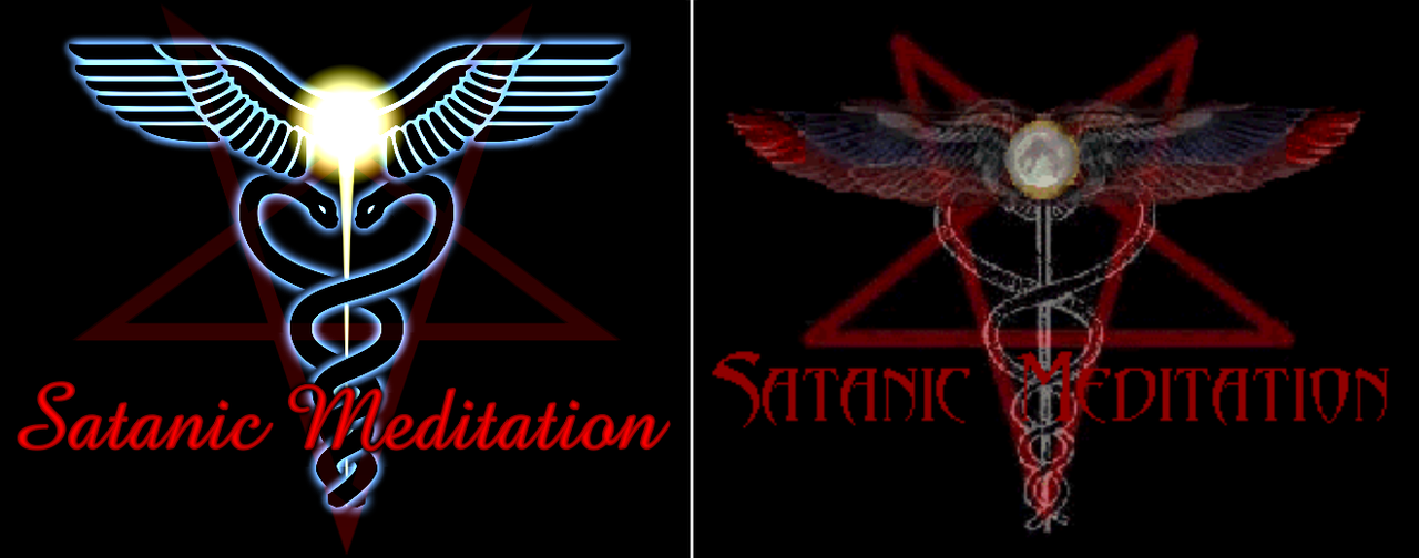
It looks very professional. Excellent work. The site looks more crisp and neat as a result. Dark Blessings.Satanic Eagle said:Here's an attempt of recreating the JOS logo at a higher resolution. The original image also had remnants of circles surrounding the pentagram, they have been removed. I've provided my remake, and a downscale of it which uses the same resolution as the original logo.
Any feedback would be appreciated.
Here's the large image, 2200 x 1028

Here's a down-scaled version, which matches the size of the original JOS logo (550 x 250)

And here's the original one for reference


Lydia said:Lydia said:I love this! The pentagrams and text next to them look stunning
I'd like to retract this statement. The JoS should stay as it is. It's our home, and HPS Maxine designed it. Keep it as it is please.
HP. Hoodedcobra666 said:There is already an ongoing effort to design these by an SS, please do not see this as voting competition, but rather as distribution of work.
I find the high blue intrusive, in that it alters the website's character more than it should. It looks "good" but not in accordance to the character of the site nor the mission which it has.
Regardless, all logos and graphics that should be redone [The artist working on this is great and spends a lot of time on improvements], will be redone as only upgrades of the ones already existing, and not something "different", let alone anything infringing of character of the site. It will be plainly the same but in HD.
Only improvements on the already known and accepted style of the JoS, which is a classic by now, will be accepted.
This has been conversed about before and the answer remains the same and definitive.
Soaring Eagle 666 said:HP. Hoodedcobra666 said:There is already an ongoing effort to design these by an SS, please do not see this as voting competition, but rather as distribution of work.
I find the high blue intrusive, in that it alters the website's character more than it should. It looks "good" but not in accordance to the character of the site nor the mission which it has.
Regardless, all logos and graphics that should be redone [The artist working on this is great and spends a lot of time on improvements], will be redone as only upgrades of the ones already existing, and not something "different", let alone anything infringing of character of the site. It will be plainly the same but in HD.
Only improvements on the already known and accepted style of the JoS, which is a classic by now, will be accepted.
This has been conversed about before and the answer remains the same and definitive.
I just reverted the Tor site back to the old version.
Sorry.
HP. Hoodedcobra666 said:Lydia said:Lydia said:I love this! The pentagrams and text next to them look stunning
I'd like to retract this statement. The JoS should stay as it is. It's our home, and HPS Maxine designed it. Keep it as it is please.
I find the high blue intrusive, in that it alters the website's character more than it should. It looks "good" but not in accordance to the character of the site nor the mission which it has.
...
HP. Hoodedcobra666 said:Lydia said:Lydia said:I love this! The pentagrams and text next to them look stunning
I'd like to retract this statement. The JoS should stay as it is. It's our home, and HPS Maxine designed it. Keep it as it is please.
I find the high blue intrusive, in that it alters the website's character more than it should. It looks "good" but not in accordance to the character of the site nor the mission which it has.
Regardless, all logos and graphics that should be redone [The artist working on this is great and spends a lot of time on improvements], will be redone as only upgrades of the ones already existing, and not something "different", let alone anything infringing of character of the site. It will be plainly the same but in HD.
Only improvements on the already known and accepted style of the JoS, which is a classic by now, will be accepted.
This has been conversed about before and the answer remains the same and definitive.
VoiceofEnki said:We have set our character, designed by Maxine in accordance to Satan’s will and wishes. It is to NEVER change.
Cobra is on command. So no wtf here.xlnt said:VoiceofEnki said:We have set our character, designed by Maxine in accordance to Satan’s will and wishes. It is to NEVER change.
I guess Maxine has given an ok to the logo change on the official website and will also decide on any eventual future changes. Otherwise wtf?
xlnt said:VoiceofEnki said:We have set our character, designed by Maxine in accordance to Satan’s will and wishes. It is to NEVER change.
I guess Maxine has given an ok to the logo change on the official website and will also decide on any eventual future changes. Otherwise wtf?
VoiceofEnki said:xlnt said:VoiceofEnki said:We have set our character, designed by Maxine in accordance to Satan’s will and wishes. It is to NEVER change.
I guess Maxine has given an ok to the logo change on the official website and will also decide on any eventual future changes. Otherwise wtf?
The Logo hasn’t been changed, just updated and looks exactly the same, aside of being higher definition. The sites character is not undermined by this sort of update.
This is why the update has to be done carefully and HPHoodedCobra is actively involved in this process in modernizing the website without undermining it’s established character.
You can be sure HPs Maxine does approve of this, as they have worked together for years and collaborated on the development of the Joy of Satan and the future prospects of our group together, with HPs Maxine giving HP HoodedCobra the access and admin rights (keys to the house and rights to the property so to speak) to our important domains so he could manage them in case she were to be too busy or other circumstances prevented her from continuing to do so.
HP HoodedCobra has always had and always will only have the best interests of the Joy of Satan in mind, and anything he does or decides to do for the Joy of Satan is in approval of Maxine and our Gods (who manage this behind the scenes, Azazel specifically does a lot in this regard) as well.
I hope hearing that from me can help some who may be confused understand and come to terms with it and any future updates to the Joy of Satan, mandated by HP HoodedCobra.
"It is my desire that all my followers unite in a bond of unity, lest those who are without prevail against them." - Satan