...
The new logo makes the sites look much nicer! However, in the old logo, I love the way the goat's eyes stare back at you! The new one just doesn't seem to capture that alive expression. I wouldn't want to ask you to spend time trying such a complicated change, so I did. Here's my attempt at creating a high-quality version of the old logo in a similar style. It's a bit brighter, and I kept the ellipse underneath, but the goat has the original face. Here's a side-by-side comparison:
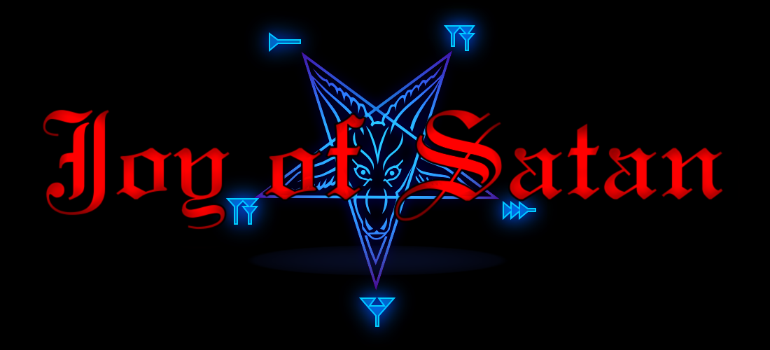

I think mine is an improvement, but both are beautiful. It's fine if we stick with your version, but I wanted to post my attempt to see what everyone thinks. I can easily tweak the effects to make it darker if you want to see how that would look.
Is there a way you could also upgrade the Icons on the startpage of the ToZ?
You know, those little white pentagrams, which lead you to the different sections like „Welcome“, „Satan“, „Zevism“ etc.
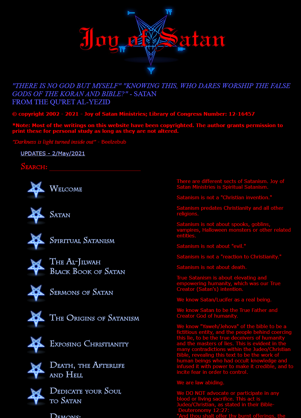
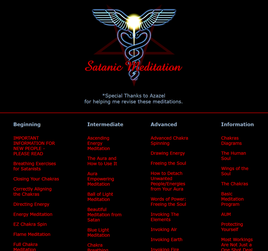
The white pentagrams do need to be updated. The new logo makes it especially obvious. I've been planning to update the whole home page, and this seems like a good time to start, so here's my version:
It is also live on the Tor siteExternal ↗.
I chose a more modern font and the new white pentagram has nothing in the center because I think the empty hole makes nice bullet points for the list. To keep the page clean, I'm going to move the "Important Information" link to the Welcome page.
Feel free to make suggestions!


 Active Translator
 Lead Translator
 Active Helper